Get inspired by some of the best law firm websites and discover 5 unique elements you can apply today.
While you sleep at night, a sales assistant is working for you 24/7 – your law firm’s website. However, does the work stop once you have a professionally built website? The truth is that today the most profitable legal websites remain on top because they’re consistently keeping their design elements and user experience up to date.
The “behind the scenes” of a website are more important than you might think. Research shows that 94% of a website’s first impression is based on its design, but what keeps users on a website is a positive user experience. When done right, a website can increase conversion rates by up to 400%!
Beyond looks, a robust website should help:
- Increase on-page conversions
- Boost quantity and quality of traffic
- House all your stellar content in a secure web portal
- Improve local SEO and Google My Business activity
- Work alongside PPC efforts, e.g., by housing your advertisement landing pages
Perhaps the most unique feature of a tailored website is that it provides a safe space and complete control over your firm’s voice. This probably explains why more firms are investing in their websites, from 77% in 2018 to 94% in 2021.
If you want to get inspired, continue on and explore some of the top law firm websites, their unique design elements, and pro-tips you can start implementing.
Olson Law Firm
From the get-go, Olson’s homepage is visually appealing. Take a quick look:

Please note: Feel free to click on the image above and explore the rest of the firm’s website.
Olson Law Firm makes the most of its main page by adding the following elements:
- A video
- Quick social proof based on their results
- Clear CTAs (Call-to-Actions)
- A free downloadable piece of content – the word “free” is one of the most enticing and powerful words. Besides, who doesn’t love gifts?!
- An image of the attorneys that helps put “a face” to the firm.
Besides a visually inviting home page, they’re also leveraging the power of visuals through their video library. Here’s a snippet:

What your firm can learn from this website
Did you know that the brain can process visuals 60,000 times faster than text? It’s possible to build credibility with the help of videos. With video, you can provide clients with success stories, verdicts, and answer FAQs. On the flip side, it gives your firm a face and places you as the expert in all things law.
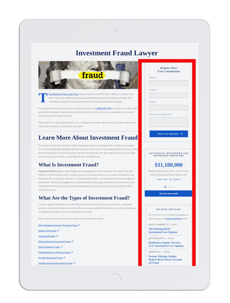
Erez Law Firm
Erez’s homepage has a solid visual hierarchy. Take a look:

Please note: Feel free to click on the image above and explore the rest of the firm’s website.
In web design, a robust visual hierarchy includes the following design elements:
- Sizing and scale: Anything scaled larger should attract attention. In this case, the headline and the financial recoveries are what initially catches the eye.
- Balance and symmetry: The images, text boxes, and menu bar are aligned and add geometric balance.
- Color: In the science behind colors, blue helps signal professionalism, power, security, and success.
As with the previous firm, they also leverage the power of visuals with a video FAQ section. What’s more, they’re making good use of their page’s space by redirecting the user to other relevant parts of the website:
What your firm can learn from this website
In design, navigability is what helps us get from A to Z. For example, add the navigation bar at the top (just like they did for their homepage), and for the other pages, interlink relevant pages with the help of a navigation bar to the right side.
Kreger Brodish Law Firm
From the start, the orange pop of color on Kreger Brodish’s homepage attracts the eye towards immediate actions like, “Contact Us For Your Free Consultation.” Yet, they remain on-brand with the firm’s logo and consistently use typography, colors, space, position, and size of images.

Please note: Feel free to click on the image above and explore the rest of the firm’s website.
For this specific firm, a unique element that stands out is their secure payment portal. They realize that people today want the convenience of online payments. Although this is common in other industries like fashion and shopping, the legal profession is still getting accustomed to this practice.
What your firm can learn from this website
Legal payments can be complicated, but firms are starting to reduce the work of manually accepting and managing costs by leaving it to secure legal payment portals like LawPay.
Joye Law Firm
Like the previous firm, Joye Law Firm uses contrasting colors, a live chat feature, and videos well.
 Please note: Feel free to click on the image above and explore the rest of the firm’s website.
The 3 other unique elements that can be seen at first glance:
- Using a distinctive slogan like “Just Call Joye” attracts attention, helps differentiate the firm, and facilitates easy recognition in a person’s mind.
- Adding the word “free” in the call-to-action reduces a prospect’s indecisiveness because something considered free signals the brain that it’s a good bargain.
- Simplifying the menu bar by adding a hamburger menu makes the design look less clustered.
What your firm can learn from this website
To strengthen your firm’s branding, you can implement small changes like a punchy slogan that can be used everywhere, from your website to your videos and ads. To help you get your slogan creativity flowing, here are a few tips:
- Keep it simple and succinct, Roughly 4-6 words.
- Think of what makes you unique, e.g., is there something you offer others don’t?
- Mix rhythm and rhyme
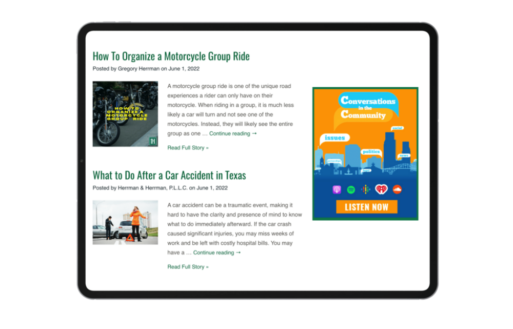
Herrman & Herrman Law Firm
The psychology of colors has taught us that colors evoke specific reactions and moods. In this case, Herrman & Herrman is using the color green, which is calming and refreshing, yet motivating and optimistic. Check it out:
 Please note: Feel free to click on the image above and explore the rest of the firm’s website.
Like the other firms, Herrman & Herrman is leveraging the power of visuals, live chats, enticing calls to action, and an amplified menu bar. Apart from that, they’re reinforcing their branding by:
- Adding empathetic copy like the one found on the homepage, “we’re here for you,” and “we can make a difference in your life.”
- Tapping into the Hispanic audience by having their website completely revamped in Spanish!
- Integrating other equally important marketing resources like a blog post section, a monthly downloadable newsletter, and a podcast. See how they use their blog post section well by linking their articles and podcast episodes.
What your firm can learn from this website
To secure success means tapping into your users, and these questions can help you tap into their world:
- How do they behave? How do you think they act?
- What do they want?
- What problems do they have?
- How can you educate them? Inspire them? And most importantly, how can you help them?
What do the best law firm websites have in common?
The best websites all actively maintain a visually appealing website that helps them convert calls and cases without headaches by partnering with the experts in all things legal marketing: Consultwebs.
If you want to assure your firm is keeping up and surpassing expectations,- we can help you take your website to even greater heights.
The post Get Inspired By The Best Law Firm Websites appeared first on Consultwebs.
from Consultwebs https://www.consultwebs.com/blog/the-best-law-firm-websites
via https://www.consultwebs.com
No comments:
Post a Comment